


Choosing a paint color can feel utterly overwhelming. The swatches are endless and the stakes seem high.
“Color sends a message,” interior designer and color consultant Mary Nolte told HuffPost. “Color can be bold or timid, bright or muted, playful or serene. They can brighten a room or create coziness. Color can create drama or relaxation. The colors you select should set the scene for the mood you are trying to create.”
Indeed, interior paint colors have the power to transform a space for a relatively affordable price. They can create a sense of cohesion in the home, while also separating out spaces.
But how to do you go about selecting the right shades for the spaces you inhabit? We asked interior designers and color experts to share their advice for choosing a paint color for your home. Read on for six questions they recommend asking yourself as you make this decision.
“When we design home interiors, we often spend time considering the look we want to go for, and how that will be conveyed to those who visit. Less often considered is how the use of color can impact both our and our visitors’ physiological and psychological state,” said Lee Chambers, an environmental psychologist who has researched the psychological aspects of color and space.
“Not until very recently in the human journey have we been able to select the color of the spaces we exist in,” he added. “The color of a space can impact a variety of factors, from how we feel in the moment, to how welcoming a space is.”
Chambers also noted that color can affect our heart rates, impact our energy levels and generate a range of responses and behaviors, which varies between individuals.
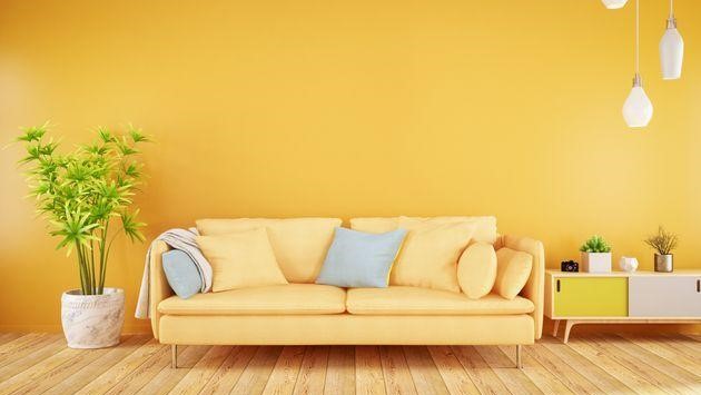
“Pinks are comforting and a great color for creativity. Blues are known as the colors of the mind so great for work-from-home office spaces.”- TASH BRADLEY, HEAD COLOR SPECIALIST AT LICK
With that in mind, you should choose colors that make you feel comfortable and at home in your house. And once you’ve settled on a general color, give that same consideration to the specific hues.
“Ask, ‘Are they warm? How vibrant is the tone and how dark is the shade?’” suggested Chambers. “While the trends have changed, and the color of the season moves, the welcoming colors don’t tend to vary too much, with soft warm colors being valued for their welcoming characteristics.”
Paint swatches on your walls and consider which ones evoke the feelings and sensibility you want in the space as you go about your day there.
“Certain colors provide a more homely feel than others, making them more appealing,” said Tash Bradley, head color specialist at the paint and wallpaper brand Lick. “We often find certain colors are consistently on trend due to the feelings they transpire into the home. Browns and beiges are stable and grounding. Pinks are comforting and a great color for creativity. Blues are known as the colors of the mind so great for work-from-home office spaces.”
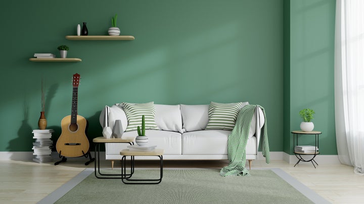
“It is worth remembering that 99.9% of our human existence wasn’t based in the built environments we have today,” Chambers said. “The colors prevalent in natural environments in abundance, such as greens and blues, will always have a welcoming element as they represent home in a way beyond our four walls.”
Colors that bring the outside in are particularly appealing now after we’ve spent so much of the last two years inside amid the COVID-19 pandemic, noted Erika Woelfel, vice president of color and creative services at Behr Paint Co.
“We launched our 2022 Color of the Year and Trends Palette last month,” she explained. “The colors bring the outdoors inside and welcome a hopeful sense of renewal, restoration and healing. Over the past year and a half, we’ve spent more time in our home than ever before, so we recommend turning to these colors if you’re looking to elevate your space and create a new sense of balance.”
She noted that hues that are reminiscent of colors found in nature can also serve as “an easy backdrop that doesn’t fight for attention with furniture, artwork and other decorations.”
“One important thing that I try to get across to my clients is that color really should represent your own personal sensibility,” said color expert Joan Ffolliott. “I think people are afraid to embrace their individuality. But paint colors can really lend a home its unique quality to the people who live there. It can be an individual expression of their style, what they value, their own particular influences, cultural influences, financial influences, all sorts of stuff.”
“[S]ome blue-green blends can give have a ‘spa-vibe’ and are supposed to be relaxing. However, if you were raised in an environment where this color negatively affected you, you might not find it relaxing at all!”- INTERIOR DESIGNER KYLIE MAWDSLEY
Interior design is about letting your personality shine through the home, whether it’s through soft, soothing paint choices or vibrant accent walls. Your individual experiences and preferences are crucial when it comes to determining the right interior paint colors for your home.
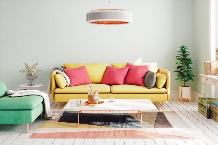
There’s often an emotional component as well. While some people adore bright saturated colors, others may feel much more at home with neutrals.
“What is appealing to one can be appalling to another!” said interior designer Kylie Mawdsley of Kylie M Interiors. “For example, some blue-green blends can give have a ‘spa-vibe’ and are supposed to be relaxing. However, if you were raised in an environment where this color negatively affected you, you might not find it relaxing at all!”
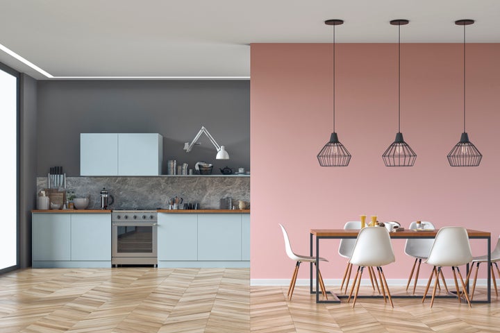
Beyond the emotions a color evokes, we also have different views of what looks luxurious or expensive. For some, it’s dark, rich colors that feel like they belong in palaces, but for others, it’s a clean white that suggest ancient statues and marble.
“Whether it’s the power symbolized by red, the noble regality conveyed by purple, the exclusive luxury conferred by black or the champion-like messaging of gold, color can be used to articulate value,” Chambers explained. “The beauty is that, as humans, we value different aspects of life, and for some, the green of the dollar may feel expensive, but to another individual, it may represent dirt and germs. It also impacts us on a cultural level, with certain colors being portrayed as expensive and exclusive, and these change depending on where in the world you reside.”
Although the goal is to choose a color that best expresses you and your desired mood, it’s OK to look at what’s popular at the moment. Sometimes trends can inspire ideas or help you identify what you definitely do or do not want.
“When it comes to selecting paint colors, interior trends and psychology are interconnected and have a bearing on a person’s color selections,” Nolte said. “Interior trends change. People tend to feel comfortable feeling ‘up to date.’ Paint color is a relatively easy and economical way to achieve a refreshed look.”
Sometimes the image we want our homes to portray and the feelings we want them to create involve feeling on trend. The trends can change and circle back around, and some colors trend because they simply feel classic and appealing at all times.
“Brasses, mauves and blush used to be associated with the 80’s and faux pas but now are all having a massive resurgence due to changes in trends,” said interior designer and color expert Jennifer Guerin. “And then there is the fact that some classic colors are just done right and truly appeal to the masses year after year.”
While trends can help guide you toward colors you like or dislike, it’s more important to consider whether your chosen color suits the space you’re painting.
“I tend to steer people away from following trends, or at least if you’re going to choose a trendy color, examine maybe why you’re doing it,” Ffolliott said. “Maybe your space doesn’t have the bones or capacity to carry that color like the one in the picture. People have Pinterest of all kinds of colors but you might not have the space for this or your architecture doesn’t support that.”
The function of the room can help dictate the feeling or mood you’re seeking to create there.
“One thing to consider is how the room is used, and the size of the room, as certain colors can create space and even facilitate and complement the use of the room,” Chambers said.
Darker colors might make a small room feel even smaller, but strategic accent walls or even ceiling paint can transform the sense of space. It’s OK to play around with bright colors if they seem to suit the vibe you’re going for.
“Making a home most desirable to fit your own personality and function is the paramount reason for investing in the right colors and paint everywhere and anywhere,” Guerin said. “Don’t stop at going big and bold on bath vanities. Look at your laundry room to infuse some fun and color and let it just be you.”
In addition to the bones of the space, you’ll also want to make sure your paint colors work with your furnishings and other decor.
“Sometimes the finishes in our homes are limiting, meaning we have to choose wall colors we don’t 100% love in order for things to flow. From there, it’s about adding the colors we love in decor, accessories or even feature walls and accents!” Mawdsley said.
If trendy paint colors don’t suit your home, you can always achieve an updated vibe with decor details.
“A person can select a paint color that works with their existing furnishings, then add some current accessories to achieve a revived space to come home to,” Nolte said.
You can also choose to make the decor more of the focal point by choosing a less bold wall paint color.
“If you’re nervous about adding color to the walls, then make your dominate hue for the walls stay as the background in a hue that reflects light and sets the stage for the accessories to bring in the fun such as throws, vases, rugs and pillows,” Guerin said. “You can change them easily as your palette evolves.”
Think about textures as well as colors, advised color consultant Amy Wax.
“The textures you choose can enhance your color selections,” she said. “Richer colors ― a deep plum, saturated charcoal grays or even navy or teal blues ― look and feel more luxurious when they are in accompanied by contrasting soft linens, shimmering wall papers or smooth velvets. On the other end of the spectrum, off-whites, feathery soft blues or even a soft blush feel luxurious against brilliant white linens and feathery soft accessories.”
Above all, get creative with the process and don’t stress too much. And if at first you don’t succeed, paint, paint again.
Source: huffpost.com
Post comments (0)